Conversion Rate Optimization by Device Type: Mobile vs Desktop vs Tablet Strategy Guide
Your conversion rate optimization strategy cannot treat all devices equally. Mobile users behave differently than desktop visitors, and tablet users fall somewhere in between with unique behaviors of their own. Understanding these differences and optimizing for each device type separately is no longer optional—it’s essential for maximizing your conversion rates in . Learn more about conversion rate by device type.
The data tells a compelling story: mobile devices now account for over 60% of web traffic, yet desktop still converts at higher rates in many industries. This conversion gap represents your biggest optimization opportunity. By implementing device-specific CRO strategies, businesses are seeing conversion rate improvements of 30-50% or more. Learn more about mobile conversion optimization issues.
This guide reveals exactly how to optimize your conversion funnel for mobile, desktop, and tablet users. You’ll learn the behavioral differences between device users, technical optimization requirements, and tactical strategies that drive measurable results. Learn more about form optimization strategies.
Understanding Device-Specific User Behavior and Intent
Device choice reveals user intent before they even land on your page. Mobile users typically seek quick answers, immediate solutions, or are in research mode during spare moments. Desktop users invest more time, conduct deeper research, and often have higher purchase intent for complex products or services. Learn more about CRO audit checklist.
Tablet users present a hybrid behavior pattern. They browse leisurely like mobile users but engage more deeply like desktop users. Evening hours see peak tablet usage, often from couches and beds, creating a relaxed browsing environment that favors longer-form content and visual experiences. Learn more about A/B testing priority framework.
Session duration varies dramatically by device. Desktop sessions average 5-8 minutes, mobile sessions clock in at 2-3 minutes, and tablet sessions fall between at 4-6 minutes. Your conversion path must accommodate these time constraints while maintaining persuasive power.
Context matters enormously. Mobile users might be standing in a store comparing prices, commuting on public transport, or waiting in line. Desktop users sit at desks with full attention and often multiple tabs open for comparison. Tablet users relax in comfortable environments with fewer distractions but less urgency to convert.
Device Performance Benchmarks You Need to Know
Conversion rates vary significantly across devices, and understanding these benchmarks helps you set realistic goals and identify optimization priorities. The average e-commerce conversion rate for desktop sits at 4.14%, while mobile converts at 2.07%, and tablet at 3.49%.
These gaps exist for specific reasons beyond just screen size. Mobile users face friction from slower load times, smaller tap targets, form-filling challenges, and connectivity issues. Desktop users enjoy faster processors, reliable connections, full keyboards, and larger screens that display complete information simultaneously.
The difference between good and great results often comes down to strategy, not effort.
| Metric | Mobile | Desktop | Tablet |
|---|---|---|---|
| Average Conversion Rate | 2.07% | 4.14% | 3.49% |
| Average Session Duration | 2-3 minutes | 5-8 minutes | 4-6 minutes |
| Bounce Rate | 58-63% | 42-48% | 45-52% |
| Pages Per Session | 2.3 | 4.1 | 3.4 |
| Load Time Tolerance | 3 seconds | 5 seconds | 4 seconds |
| Form Abandonment Rate | 68% | 41% | 52% |
Industry variations add another layer of complexity. B2B services see desktop conversions at 3-4x higher rates than mobile, while food delivery and local services convert better on mobile. Your optimization strategy must account for your specific industry patterns, not just general benchmarks.
Time-of-day patterns also differ by device. Mobile peaks during commute hours and lunch breaks, desktop dominates business hours, and tablet usage spikes in evenings and weekends. Align your campaigns and testing schedules with these usage patterns for maximum impact.
Mobile Conversion Rate Optimization Strategies
Mobile optimization starts with speed—nothing else matters if your page loads slowly. Every second of delay costs you 7% in conversions. Compress images aggressively, implement lazy loading, minimize JavaScript, and use AMP or similar frameworks for critical landing pages.
Simplify your mobile navigation ruthlessly. Hamburger menus work when organized logically with your most important conversion paths at the top. Sticky headers with prominent CTAs keep conversion opportunities visible as users scroll. Bottom navigation bars place actions within thumb reach on larger phones.
Forms represent the biggest mobile conversion killer. Reduce form fields to absolute necessities—every field you remove increases conversions by 10-20%. Use autofill, smart defaults, and address lookup APIs to minimize typing. Replace dropdowns with radio buttons or segmented controls for better mobile UX.
Mobile CTAs require special attention. Buttons need minimum 44×44 pixel tap targets with adequate spacing to prevent mistaps. Place primary CTAs prominently above the fold and repeat them strategically throughout longer pages. Use contrasting colors that stand out on small screens in various lighting conditions.
Implement click-to-call functionality prominently for service businesses. Mobile users prefer calling to form-filling by a 3:1 margin. Make phone numbers tappable, include click-to-call buttons near key information, and consider using messaging apps like WhatsApp as conversion channels.
Streamline your mobile checkout process into as few steps as possible. Single-page checkouts convert better on mobile despite conventional wisdom. Guest checkout options reduce friction significantly—forcing account creation kills 23% of mobile conversions. Offer mobile payment options like Apple Pay and Google Pay for one-tap purchasing.
Desktop Conversion Rate Optimization Strategies
Desktop users expect and consume more information, so leverage that screen real estate strategically. Multi-column layouts work beautifully on desktop, letting you present product details, testimonials, and CTAs simultaneously without scrolling. Comparison tables and feature matrices perform exceptionally well with desktop’s horizontal space.
Detailed product pages convert desktop traffic better than minimal designs. Include comprehensive specifications, multiple high-resolution images with zoom functionality, detailed descriptions, and robust FAQ sections. Desktop users research thoroughly before converting—give them the information they crave.
Exit-intent popups work effectively on desktop where mouse tracking enables precise triggering. Use them strategically for capturing emails, offering discounts to hesitant buyers, or presenting alternative products. Keep the messaging relevant to the page content and user behavior for maximum effectiveness.
Live chat drives significant desktop conversion uplift, with implementation boosting rates by 15-30%. Desktop users multitask more comfortably, making them ideal candidates for chat interactions while browsing. Proactive chat triggers based on time-on-page and scroll depth engage users at optimal moments.
Desktop forms can include more fields without destroying conversions, but that doesn’t mean they should. Progressive disclosure works well—show essential fields first, then reveal additional optional fields after initial submission. Multi-step forms with progress indicators convert better than long single-page forms even on desktop.
Leverage desktop’s superior processing power for rich interactive experiences. Product configurators, calculators, comparison tools, and interactive demonstrations engage desktop users and drive conversions. These experiences often prove too resource-intensive for mobile devices but excel on desktop.
Tablet Conversion Rate Optimization Strategies
Tablets occupy a unique middle ground that many businesses neglect to their detriment. Tablet traffic represents 5-15% of visits for most sites but often converts at rates closer to desktop than mobile. This valuable segment deserves dedicated optimization attention.
Tablet users prefer landscape orientation for browsing and shopping by a 2:1 margin. Design your layouts to look compelling in landscape mode first, then adapt for portrait. This differs from mobile-first design and requires separate consideration during development.
Touch targets remain crucial on tablets despite larger screens. Users still navigate by touch, so maintain generous 44×44 pixel minimum tap targets with adequate spacing. However, you can present more information per screen than mobile, finding the sweet spot between mobile simplicity and desktop density.
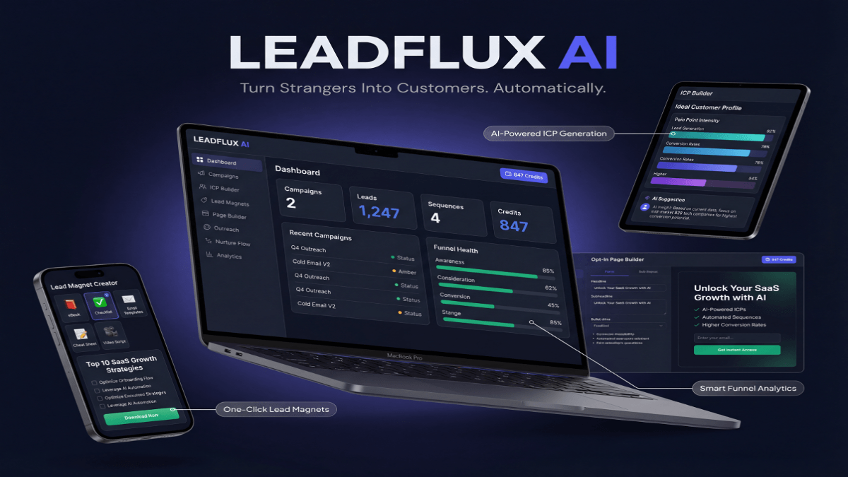
Stop Guessing. Start Converting.
LeadFlux AI Does the Heavy Lifting.
Tracking KPIs is only half the battle — you need a system that turns data into revenue. LeadFlux AI automatically identifies your highest-value prospects, scores leads in real time, and delivers conversion-ready pipelines so you can focus on closing deals, not chasing dead ends.
See How LeadFlux AI WorksTablet users engage heavily with visual content. Large, high-quality images and videos perform exceptionally well. Product galleries with swipe navigation feel natural on tablets. Video demonstrations see higher completion rates on tablets than either mobile or desktop.
Form optimization for tablets follows mobile best practices with slight relaxations. You can include one or two more fields than mobile forms without significant conversion drops. Virtual keyboards on tablets provide a better typing experience than phones, reducing form abandonment rates.
Consider tablets your testing ground for mobile improvements. Tablet users tolerate slightly longer load times and more complex interactions than mobile users. Test new features on tablets first, gather data, then decide whether to deploy to mobile or reserve for desktop.
Technical Implementation and Testing Approaches
Responsive design remains the foundation of device-specific optimization, but responsiveness alone doesn’t optimize conversions. You need adaptive content strategies that serve different experiences based on device detection. This means different headlines, CTAs, content lengths, and conversion paths per device type.
Implement device-specific A/B testing rather than testing the same variations across all devices. What converts mobile users often fails on desktop and vice versa. Run parallel tests customized for each device’s unique characteristics and user expectations. Many testing platforms now support device-segmented experiments natively.
Server-side device detection enables more sophisticated optimization than CSS breakpoints alone. Detect device type server-side to serve appropriately sized images, load device-specific scripts, and customize content before the page even renders. This approach dramatically improves performance while enabling deeper personalization.
Analytics segmentation by device reveals optimization opportunities hidden in aggregate data. Create device-specific conversion funnels, analyze drop-off points separately, and identify device-specific friction points. A page performing well overall might have terrible mobile performance masked by strong desktop numbers.
Heat mapping and session recording tools provide device-specific insights into user behavior. Watch actual mobile users struggle with forms, see where desktop users hover before bouncing, and understand why tablet users abandon at specific steps. These qualitative insights guide quantitative testing priorities.
Performance monitoring must happen separately by device. Mobile performance differs wildly from desktop even on the same connection. Monitor real user metrics like Time to Interactive and First Input Delay segmented by device to identify performance issues affecting specific user groups.
Cross-Device Conversion Path Optimization
Users rarely convert on their first visit or on a single device. The modern conversion path winds across devices as users research on mobile, compare on desktop, and purchase on whichever device is convenient. Your optimization strategy must account for these cross-device journeys.
Device handoff represents a massive optimization opportunity. Users who browse on mobile and return on desktop convert at 2-3x higher rates than single-device users. Make handoffs seamless with easy ways to save progress, email product links, and sync shopping carts across devices.
Email plays a critical cross-device role. When users abandon carts on mobile, your recovery email likely gets opened on desktop where conversion rates soar. Optimize your abandonment sequences for cross-device journeys rather than expecting same-device returns.
Progressive conversion strategies work brilliantly across devices. Capture emails on mobile with minimal friction, then nurture those leads with content and offers optimized for desktop conversion. Each device plays to its strengths in a coordinated strategy rather than competing for the same conversion actions.
Retargeting campaigns should consider device context. Users who browsed on mobile but didn’t convert see desktop-optimized ads when browsing on desktop later. Match your retargeting creative and landing pages to the device where the ad appears for maximum conversion impact.
Account creation and sign-in functionality enables cross-device conversion tracking and optimization. Offer passwordless authentication options like magic links and social login to reduce friction. Users with accounts provide rich cross-device behavioral data that informs optimization decisions.
Advanced Device-Specific Tactics for
Progressive Web Apps blur the line between web and native apps, offering mobile users app-like experiences without installation friction. PWAs load instantly, work offline, and can send push notifications—all features that boost mobile conversion rates significantly. Install prompts convert mobile visitors into engaged app users.
Voice search optimization matters more on mobile where 27% of users employ voice search regularly. Optimize for conversational queries, implement structured data for featured snippets, and ensure your mobile pages answer specific questions concisely. Voice searches often have higher commercial intent.
Device-specific personalization engines tailor experiences based on device capabilities and user behavior patterns. Show mobile users simplified product selections based on their browsing history. Present desktop users with advanced filtering and comparison tools. Use tablet’s visual strengths for lifestyle imagery and aspirational content.
Accelerated Mobile Pages still matter for certain industries and traffic sources. AMP pages load almost instantly, dramatically reducing mobile bounce rates. While Google no longer requires AMP for search ranking, the performance benefits justify implementation for content-heavy sites and publishers.
Augmented reality features on mobile devices create engaging shopping experiences that drive conversion uplift. Virtual try-on for fashion and cosmetics, furniture placement visualizers, and product demonstrations in real environments reduce purchase uncertainty. AR features see adoption rates 40% higher than static images.
Biometric authentication on mobile devices removes friction from returning customer conversions. Face ID and fingerprint authentication enable instant checkout without password entry or form completion. Implement these payment shortcuts to capitalize on mobile’s installed authentication capabilities.
Desktop continues evolving with larger screens and higher resolutions. Design for 1920px and wider viewports without abandoning users on smaller desktop screens. Ultra-wide layouts can showcase more products simultaneously, present rich media experiences, and reduce scrolling that causes desktop bounce.
Device-specific conversion optimization demands ongoing attention as user behaviors and technology capabilities evolve. Mobile devices grow more powerful while desktop usage patterns shift toward serious research and complex transactions. Tablet users adopt their devices for specific use cases where the form factor provides advantages.
The businesses winning at conversion optimization in treat each device type as a distinct audience with unique needs, contexts, and conversion paths. They test relentlessly on each platform, optimize experiences separately, and create seamless handoffs between devices. Your conversion rate optimization strategy must do the same to maximize results across your entire traffic mix.
For more conversion optimization insights, explore our articles on lead magnet optimization, email sequence conversion tactics, and landing page personalization strategies. External resources like Google’s Mobile-Friendly Test, WebPageTest for performance analysis, and the Nielsen Norman Group’s UX research provide valuable tools and insights for device-specific optimization.