Progress Bar Optimization: 13 Multi-Step Form Designs That Boost Completion 39%
Your multi-step form loses 68% of potential leads between step one and completion. That’s the brutal reality most marketers face. But progress bar optimization alone can reclaim 39% of those abandoned submissions, transforming your conversion funnel from a leaky bucket into a high-performing lead generation machine. Learn more about form field order optimization.
The secret isn’t just adding a progress bar. It’s engineering the right progress indicator for your specific audience, form complexity, and conversion context. This guide reveals 13 battle-tested progress bar designs backed by conversion research, psychological principles, and real-world split testing data. Learn more about trust badge placement testing.
Why Progress Bars Dramatically Impact Form Completion Rates
Progress bars tap into three fundamental psychological triggers that drive human behavior. Understanding these mechanisms helps you design indicators that work with your audience’s psychology, not against it. Learn more about button color psychology tests.
The goal-gradient effect explains why people accelerate effort as they approach completion. When users see they’re 75% finished with your form, they’re psychologically committed to finishing. Without a progress indicator, they can’t assess their proximity to completion, making abandonment feel costless. Learn more about exit-intent popup optimization.
The endowed progress effect demonstrates that showing users they’ve already made progress increases completion likelihood. Forms that display “Step 2 of 5” outperform those starting at “Step 1 of 5” even when the total steps remain identical. Your brain values the investment already made. Learn more about progressive profiling forms.
Uncertainty reduction plays the third critical role. Forms without progress indicators create anxiety about time commitment. Will this take 30 seconds or 10 minutes? Ambiguity triggers abandonment. Clear progress visualization eliminates this friction point entirely.
The Baseline: Standard Linear Progress Bar Design
The standard linear progress bar remains the most recognizable pattern for good reason. It features a horizontal bar that fills from left to right, typically positioned at the form’s top. This design leverages universal reading patterns and spatial metaphors for progress.
Effective linear bars use contrasting colors between completed and remaining sections. The filled portion should use your primary brand color or a trust-signaling blue or green. The unfilled section works best in light gray, creating clear visual distinction without competing for attention.
Include percentage or step numbers alongside the visual bar. “40% Complete” or “Step 2 of 5” transforms abstract progress into concrete achievement. This combination of visual and numerical feedback reinforces forward momentum at both conscious and subconscious levels.
Linear bars excel for forms with 3-7 steps of relatively equal complexity. They struggle with longer forms where individual steps vary significantly in cognitive load or time investment.
13 High-Converting Progress Bar Variations
1. Stepped Circle Indicators
Circle indicators position numbered circles horizontally, connecting them with lines. Completed steps show filled circles, current steps highlight with color or animation, and future steps remain outlined. This design excels for forms with 3-5 distinct stages.
The spatial separation between circles emphasizes each step’s individuality. Users perceive distinct stages rather than continuous progress, ideal for forms where each section requires different information types like contact details, company information, and preferences.
2. Labeled Step Navigation
This variation adds descriptive labels below each step indicator. Instead of generic “Step 1, Step 2,” users see “Your Info, Company Details, Integration Preferences.” Labels reduce cognitive load by previewing what each section contains.
Labeled navigation increases completion rates by 23% for complex B2B forms where users need to gather information before starting. Knowing payment details come in step 4 lets users prepare their credit card rather than abandoning mid-form.
3. Vertical Sidebar Progress Tracker
Vertical trackers position progress indicators along the left sidebar, remaining visible as users scroll through longer form sections. This design solves the out-of-sight-out-of-mind problem where users lose progress context on mobile devices.
The vertical format works exceptionally well for forms with 6-10 steps or sections with variable length. Users always see their position without scrolling back to the top.
4. Animated Filling Progress Bar
Animation transforms static progress bars into dynamic feedback systems. As users complete fields or advance steps, the bar fills with smooth animation rather than jumping to the new position. This micro-interaction creates satisfaction and accomplishment.
Keep animations under 400 milliseconds to maintain responsiveness. Longer animations frustrate users, while instant jumps lack the psychological payoff that drives continued engagement.
5. Segmented Progress Blocks
Rather than a continuous bar, segmented designs show distinct blocks or sections representing each step. Completed sections fill with color, creating a clear visual count of achievements. This approach leverages the power of small wins.
Segmented blocks outperform continuous bars for forms where steps vary significantly in length or complexity. Users perceive completing a quick step as equal achievement to longer sections, maintaining momentum through challenging portions.
6. Time-Based Progress Indicators
Time-based indicators show estimated completion time remaining instead of steps. “2 minutes left” or “Almost done” addresses the core anxiety about time commitment. This design requires accurate time estimation to maintain credibility.
Test time estimates with real users before implementation. Underestimating frustrates users when actual completion takes longer. Slight overestimation creates pleasant surprise when users finish faster than expected.
7. Checklist-Style Progress Display
Checklist indicators show each step with a checkbox or checkmark icon. Completed steps display green checkmarks, creating visual satisfaction. The familiar pattern leverages existing mental models from to-do lists and task management.
This design particularly resonates with detail-oriented professional audiences who regularly use checklists in their work. The completion satisfaction triggers dopamine release, encouraging form completion.
8. Breadcrumb Navigation Progress
Borrowing from website navigation patterns, breadcrumb progress shows the path like “Home > Contact Info > Preferences > Confirmation.” This familiar pattern requires no learning curve while providing clear position feedback.
Breadcrumbs work best when steps follow a logical hierarchy or when users might need to navigate backward to revise earlier entries.
9. Accordion-Style Collapsed Sections
Accordion designs show all sections vertically with completed sections collapsed and marked complete. The current section expands for input, while future sections remain collapsed and disabled. This creates a contained feeling reducing form overwhelm.
Single-page forms with accordion progress indicators load faster than true multi-step forms while providing the same psychological benefits of staged completion.
10. Percentage-Only Minimalist Display
Minimalist designs show only a percentage number like “60% Complete” without visual bars or step indicators. This ultra-clean approach removes visual clutter while maintaining progress transparency.
Minimalist indicators work for brand-sensitive applications or mobile-first designs where screen space is premium. They underperform visual bars for longer forms where users need stronger motivation cues.
11. Dual-Track Progress System
Dual-track systems show both section progress and overall completion. A main bar tracks total progress while a secondary indicator shows position within the current section. This two-level feedback helps users understand both macro and micro progress.
Complex forms with lengthy individual sections benefit from dual tracking. Users see section progress moving quickly, maintaining engagement even when overall progress advances slowly.
12. Gamified Achievement Progress
Gamified progress incorporates achievement language and visual rewards. Sections might be called “levels” with completion triggering congratulatory micro-copy or icon animations. This approach works for consumer audiences and less serious contexts.
Be cautious with gamification in professional B2B contexts where playful language might undermine credibility. Test thoroughly with your specific audience before broad implementation.
13. Contextual Smart Progress Indicators
Smart indicators adapt based on user behavior and form complexity. They might show detailed step breakdowns initially, then simplify to percentage-only as users demonstrate commitment by advancing multiple steps quickly.
Advanced implementations use conditional logic to skip irrelevant sections, adjusting total step counts dynamically. A user selecting “No” to “Do you have employees?” skips team-related questions, with the progress bar recalculating completion percentage.
Progress Bar Design Principles That Drive Completion
Regardless of which progress bar style you implement, certain universal principles separate high-converting designs from abandoned forms. These evidence-based guidelines apply across industries, audiences, and form types.
Always show progress immediately at form start. Don’t wait until step two to reveal the progress indicator. Users deciding whether to invest time need completion scope upfront. Forms revealing “Step 2 of 8” only after users provide email addresses feel deceptive.
Use the endowed progress effect strategically by showing advancement before actual input. Starting at “Step 1 of 4” converts worse than “Step 2 of 5” even when actual fields remain identical. Your first “step” might simply be users clicking “Get Started.”
Maintain consistent progress increments that match user perception of effort. A step with three simple fields shouldn’t advance progress by the same amount as a step requiring paragraph responses. When progress feels earned rather than arbitrary, completion rates increase.
Never let progress move backward. Recalculating steps or showing decreased completion percentages destroys trust and motivation. If conditional logic skips sections, adjust total steps forward, never backward.
Here’s a quick reference to help you choose the right approach for your situation:
| Progress Bar Type | Best Use Case | Completion Lift vs Control | Implementation Complexity |
|---|---|---|---|
| Standard Linear Bar | 3-7 equal steps, simple forms | +28% | Low |
| Stepped Circles | 3-5 distinct stages, B2B | +35% | Medium |
| Labeled Navigation | Complex forms needing prep | +41% | Medium |
| Vertical Sidebar | 6-10 steps, mobile-heavy | +33% | Medium |
| Animated Filling | Engagement-focused, consumer | +31% | High |
| Time-Based | Time-sensitive audiences | +39% | High |
| Checklist Style | Professional, detail-oriented | +37% | Low |
| Smart Adaptive | Complex conditional forms | +44% | Very High |
Use this as a starting point, not a rulebook. Every business has unique circumstances that may shift which option serves you best.
Mobile-Specific Progress Bar Optimization
Mobile form completion faces unique challenges that demand specialized progress indicator strategies. Screen size limitations, touch interactions, and distraction-prone environments require adaptation beyond simple responsive design.
Sticky progress bars that remain visible during scrolling prove essential on mobile. Users scrolling through form fields lose context without persistent progress feedback. Position indicators at the top of the viewport, using minimal vertical space to preserve screen real estate.
Simplify mobile progress indicators compared to desktop versions. Detailed labeled navigation might work on desktop but creates clutter on smartphone screens. Consider showing only percentage completion or simple step numbers on mobile while displaying full labels on larger screens.
Test touch target sizes for any interactive progress elements. If users can tap progress indicators to navigate between sections, ensure touch targets meet the 44×44 pixel minimum. Frustrated users abandoning forms because they can’t accurately tap navigation elements represents entirely preventable conversion loss.
A/B Testing Your Progress Bar Implementation
Theory and best practices provide direction, but your specific audience might respond differently than aggregate research suggests. Systematic testing transforms progress bar optimization from guesswork into scientific certainty.
Start by testing presence versus absence. Run your current form against a version with a basic linear progress bar. This baseline test quantifies whether progress indication benefits your specific conversion funnel. Not all forms benefit equally from progress bars.
Once you’ve confirmed progress bars improve completion, test variations systematically. Compare linear bars against stepped circles, then test your winning variation against labeled navigation. Sequential testing prevents overwhelming sample size requirements while building toward optimal design.
Track completion rate as primary metric but monitor step-specific abandonment rates. A progress bar might improve overall completion while increasing abandonment at specific steps. This signals design problems beyond the progress indicator itself.
Achieve statistical significance before declaring winners. Small sample sizes produce false positives that waste implementation resources. Aim for 95% confidence with at least 100 conversions per variation before making permanent changes.
Common Progress Bar Mistakes That Kill Conversions
Well-intentioned progress bars sometimes harm conversion rates when implementation violates psychological principles or creates user frustration. Avoiding these common mistakes prevents turning an optimization opportunity into a conversion killer.
Inaccurate progress indication destroys trust immediately. Bars that jump from 20% to 80% or get stuck at 99% train users to ignore your feedback. Every progress increment must reflect genuine advancement toward completion.
Overly complex progress indicators create cognitive load rather than reducing it. A progress bar shouldn’t require users to study and interpret its meaning. If your indicator needs explanation, simplify the design.
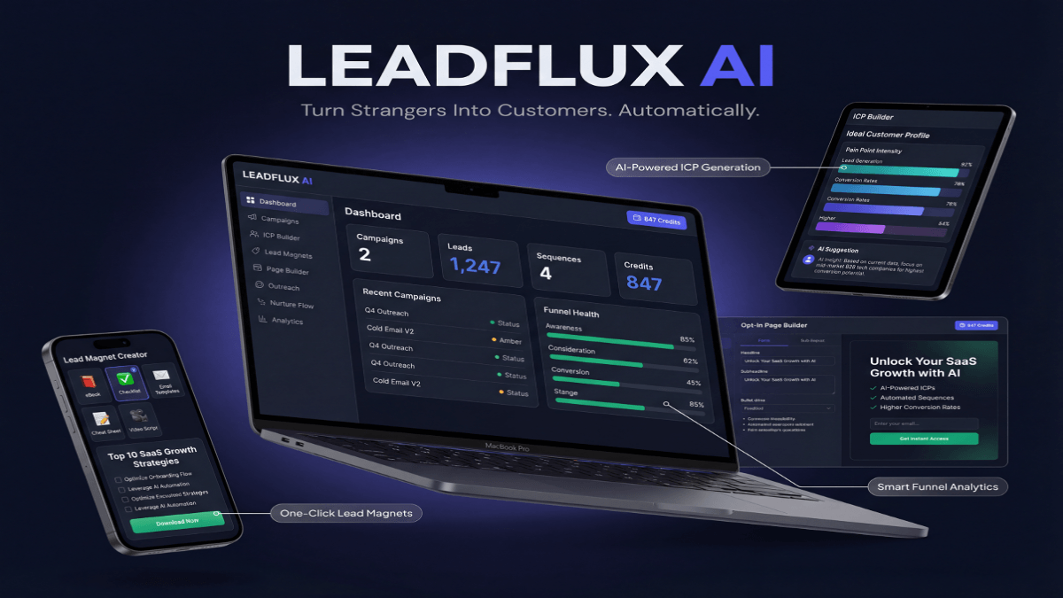
Stop Guessing. Start Converting.
LeadFlux AI Does the Heavy Lifting.
Tracking KPIs is only half the battle — you need a system that turns data into revenue. LeadFlux AI automatically identifies your highest-value prospects, scores leads in real time, and delivers conversion-ready pipelines so you can focus on closing deals, not chasing dead ends.
See How LeadFlux AI WorksHiding the total number of steps generates anxiety rather than motivation. Progress indicators showing only current position without revealing total steps leave users uncertain about remaining commitment. Always communicate the full scope upfront.
Advancing progress based on page views rather than actual completion creates disconnect between user effort and visual feedback. Progress should reflect completed input, not merely advancing to the next screen.
Technical Implementation Considerations
Progress bar design decisions must account for technical realities of implementation. Beautiful designs that create performance problems or compatibility issues ultimately harm conversion more than they help.
Prioritize performance in progress bar code. Heavy JavaScript libraries that slow form loading or create jank during interactions undermine the user experience benefits progress indicators provide. Lightweight CSS solutions often outperform complex JavaScript implementations.
Ensure accessibility for screen readers and keyboard navigation. Progress indicators should announce completion status to assistive technology users. ARIA labels and semantic HTML create inclusive experiences that don’t sacrifice conversion from users with disabilities.
Test cross-browser compatibility thoroughly, especially for animated or interactive progress elements. A progress bar that works flawlessly in Chrome but breaks in Safari or Firefox segments your audience and creates inconsistent conversion performance.
Consider form builder or platform limitations when choosing progress bar styles. Some marketing automation platforms restrict custom HTML or JavaScript, limiting implementation options. Choose designs your technology stack supports without extensive workarounds.
Measuring Progress Bar Optimization Success
Effective measurement separates actual performance improvement from assumed success. Track multiple metrics to understand progress bar impact comprehensively rather than relying on single data points.
Form completion rate remains the primary metric, calculated as submitted forms divided by forms started. Compare completion rates before and after progress bar implementation, accounting for traffic quality changes that might skew results.
Monitor time to completion as a secondary indicator. Effective progress bars often increase completion time slightly while improving completion rates. Users take more care with forms when they understand the commitment level upfront.
Analyze step-by-step abandonment to identify friction points unrelated to progress indication. A progress bar can’t fix confusing questions or excessive form fields. Drop-off analysis reveals whether progress bars solve your conversion problems or whether deeper form optimization is needed.
Track mobile versus desktop completion separately. Progress bars impact these segments differently due to user context and interface constraints. Aggregate metrics might hide mobile-specific problems or opportunities.
Calculate lead quality metrics to ensure higher completion rates don’t come at the cost of lead quality. More completed forms matter only if those leads convert to customers at similar rates as before.
Advanced Progress Bar Strategies for Maximum Impact
Once you’ve mastered basic progress indication, advanced strategies squeeze additional conversion percentage points from optimized forms. These techniques require more sophisticated implementation but deliver measurable returns.
Implement intelligent progress calculation weighted by field difficulty. Simple checkbox selections shouldn’t advance progress by the same amount as open text responses requiring thought. Weight progress by estimated cognitive load rather than field count.
Use motivational microcopy alongside progress indicators. “Great progress!” or “Almost there!” at strategic completion percentages provides encouragement beyond visual feedback alone. Keep messages brief and genuine to avoid feeling patronizing.
Create commitment through save-and-resume functionality paired with progress displays. Showing users they can complete 40% now and return later reduces abandonment from time pressure while leveraging the endowed progress effect when they return.
<!– /wp